Rene Magritte 'The Treachery of images (Ceci n'est pas une pipe)' 1928-29
Words are all around us. They are everywhere we look. We probably do not stop to consider how they influence us. In the painting above Rene Magritte has painted an image of a pipe and underneath it, in French, he has written 'This is not a pipe'. At first this seems ridiculous as it is clearly a pipe. However, there is no pipe there, only paint smeared on a canvas creating the illusion or representation of a pipe. Magritte is write - this is not a pipe and he has used words and images to play a game with us.
'Signs, New York' 1928–30 Walker Evans
We are surrounded by Type and we encounter it every minute of every day - almost everywhere we look. Type is on the keyboard I am typing on, on the computer screen you are viewing now, on books we read, on adverts - telling us what to buy, instructions and information signs - telling us what to do, on street signs - telling us where to go, graffiti ... the list goes on and on.
A section from Peter Blake's Alphabet (after Walker Evan) 2003
The British Pop artist Peter Blake created a whole alphabet by taking close up shots of street signs. Blake was inspired by the American photographer Walker Evans who, after a life of black and white photography, used a cheap colour Polaroid camera to photograph the every day and mundane. Blake, like many artists, has several collections. Like a magpie he collects anything that captures his eye. Blake's collection was shown at the Museum of Everything #3 in an old warehouse. Here he has simply collected all the fonts found around him.
Ed Fella - 'Letters on America'
In his book 'Letters on America' Ed Fella explores the folk typography found on his travels. This simple task results in a rich body of work and a great resource for typography designers.
Still from William Klein's - 'Broadway by Light' 1958
stills from William Klein's 'Broadway by Light' 1958
These still images from William Klein's mediative study of New Yorks Times Square is a 12 minute expressionistic film (watch it here). It focusses on iconic advertising - especially the neon typography and bold colours.
Alan Fletcher - Detail of a Pirelli poster for a double Decker Bus 1961
Images of found type by Robert Brownjohn from 'Street Level' 1961 in 'Typographica' design magazine.
Ideas are all around us - and ideas for typography can be found on our own door steps. These images show how ephemeral and vernacular signs can inspire graphic design. The collection of images above show how type can become distorted - on an umbrella, on an old sack, painted onto shutters or behind distorted glass. This distortion can then be used in a new type design - for example the 'Pepsi Cola World' advert above or Alan Fletcher's Pirelli poster.
All these images come from an article in 'Typographica' (1949 - 1967) - a pioneering graphic design magazine edited by Herbert Spencer (the name Typographica is now used by a website about typography - typographica.org). Spencer used layout and images to tell a story or make an argument, creating photo essays by combining type and images.In addition to this photography was key to much of the graphic design produced. This particular article was based on photographs taken by Robert Brownjohn that he then compared to typography designed by his colleagues.
Poster by Alan Fletcher
Jumbled wonky wooden letters raised on stilts are transformed into a dynamic moving poster design.
Fonts seen through glass becomes a distorted vibrant font.
Tarmac over a road sign provides inspiration for a broken font.
Alan Fletcher
A weather decayed painted sign reveals an older sign. This jumbling of letters can be seen in the two type design above. Different fonts merge together combined with the dramatic contrast between black and white.
These images and the alphabet by Blake show that photography can be used to document ideas for typography projects. All that is needed is a keen eye and an open mind.
We can see this process in action - a modern typographer taking inspiration from the built environment. The Vector Lab has documented their evolution of the design on a you tube video. The photograph above provided the inspiration for the typographers initial sketch.
The sketch was then scanned into Illustrator and used as the basis of the design.
The design was then printed out on a ink jet printer.
This allowed water to be added and then the design was worked into with pencil, then scanned back into Illustrator.
The final design combines digital technology with more a more traditional approach. You can watch the whole process here. The flowing letter forms are reminiscent of the ornate lettering designs on late 19th century/early 20th century insurance maps.
These ornate letterforms were taken from title pages and headings from Sanborn Fire Insurance Maps issued between 1880 and 1920 (see more here).
In this Classic typography exercise, students interpret the meaning of a word by adjusting the spacing, scale, and position of letters on a page (for more information go here).
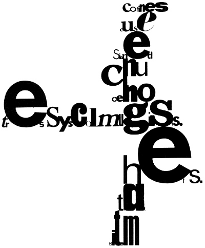
The musician John Cage also created poetry and art using elements such as chance. His images often have the fluidity of a piece of music – giving visual form to sound. Cage’s ‘Mesostics’ are his chance experiments with writing creating visually striking graphic texts.
Create your own drawings out of fonts here or whole words here. This could also be done with photocopied text and glue.
Paul Elliman 'My Typographies (2)' 1994 (read an interview here)
Paul Elliman 'Found Fonts' - section of MOMA exhibition "Ecstatic Alphabets/Heaps of Language"
Found object - from cardboard boxes to ambiguous pieces of plastic trash, inspire the typography of Paul Elliman. He displayed some of his inspirations at the MOMA exhibition 'Ecstatic Alphabets/Heaps of Language'.
Paul Elliman
In this sequence of images above we can see Elliman's collection of found objects (or Found Fonts) along with an alphabet and font designed using this technique.
In this sequence of images we can see how David Buckingham reuses old metal to constructs his work. This piece is from a series where Buckingham quotes from cinema - giving physical solid form to words. http://www.body-pixel.com/2010/01/05/human-body-and-typography-gallery/
Anthony Burrill
Anthony Burrill uses the Letterpress protest to create his bold graphic posters base around slogans.
Bob and Roberta Smith
Bob & Roberta Smith 'Great Artist' 1999
Bob and Roberta Smith 'I believe in Joseph Mallard William Turner' 1998
Ed Ruscha
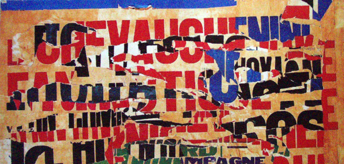
Ideas for typography can be taken from anywhere - we are surrounded by type. Anything, anywhere has the potential to start a piece of design or influence an artwork. Old shop signs, hand painted signs, trash, objects, collage.....they can all be potential starting points.
Ideas for typography can be taken from anywhere - we are surrounded by type. Anything, anywhere has the potential to start a piece of design or influence an artwork. Old shop signs, hand painted signs, trash, objects, collage.....they can all be potential starting points.


